Ad Design. Ugh…
Creating a good ad design can be a daunting task, especially when you’re short on time and trying to advertise in such a competitive world! How do we go about creating ads quickly that will catch our target audience’s attention?
As challenging as it may seem, it can be quite simple to whip up some eye-catching designs quickly and easily! Below are five tips to make your ad design stand out and specifically reach the audience you are trying to target:
1. Use Contrast in Your Ad Design
Use colors that contrast against each other, creating an eye-catching ad design that emphasizes the most important features. The goal is to make an ad that stands out. Using contrasting dark and light colors will get you there!
Be sure to create hierarchy as well…
Make the words stand out in a way that leads the viewer’s eyes in the right direction, making the first thing you want them to see on the ad stand out more.
Make sure to include a dramatic call-to-action. A dramatic call-to-action emphasizes and encourages your viewer to take the action that you want them to (GCFLearnFree.org).

2. Take Advantage of Whitespace
Whitespace is a powerful tool to use. By keeping space around the elements in your ad design, it draws your viewer’s eye to the most important things that you want emphasis on. Keep related content together and unrelated content separated (GCFLearnFree.org).
Remember: Keep it Simple. Keep it Clean.

3. Think Outside the Box
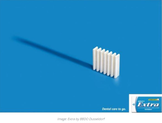
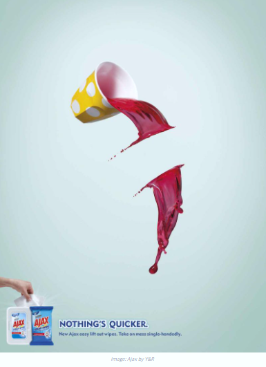
Go ahead and manipulate your imagery to create an impossible or surreal situation. Creating a strange situation will draw the viewer’s eyes – but be sure to keep it relevant to the message you want to convey.
Play with colors and design to create a dramatic, eye-catching effect. Colors and design can strongly influence your message and draw the attention you desire (Canva).

4. Show, Don’t Tell
This tip might seem counterintuitive, but it creates a mystery that catches and keeps the viewer’s attention longer. It ignites the viewer’s desire to figure the ad out.
These kinds of ads have the power to stop the viewer in their tracks – people love figuring things out and finding meaning.
This kind of advertising also encourages the viewer to create their own story around the ad, making it more personal for the viewer, but the main point you want to communicate still gets across.
Be sure to use vibrant colors and texture to make the photo more eye-catching and dramatic (Canva).

5. Keep it Consistent
Last, but not least, keep your branding consistent for all of your advertisements. You want your audience to know who you are. You want people to look at your ad and know immediately who it is from.
Make sure every advertisement has your business logo, font, and colors to make it clear that the ad belongs to you (GCFLearning.org).
One easy way to keep this simple is to create different templates that you will use for your ads. This ensures that there is a creative way to easily incorporate your business branding into each unique ad.

Incorporating these five tips into your advertisements will create eye-catching, stand-out ads that will entertain and encourage interactions from your users.
Before we go, here are just a few more tips to be aware of when making your ads:
- Be sure to follow these guidelines for all of your advertising across the web, social media channels, and your app (if you have one).
- Have your audience in mind when making your ads. You want to create ads that appeal to them and you want to emphasize aspects that would attract their eye.
- Always, always, always be professional! Too much of a good thing turns it into a bad thing. Make sure when you incorporate these five tips to not overdo it.
- Avoid clutter. You want someone to be able to get the message of your ad within 2 to 8 seconds – especially on social media. If your ads take too much time to view, a viewer will ignore and scroll on.
Make sure to match your ads to the correct social media channels: some social media channels are more visual than others.
Some channels require more text than others. You want your ads on each specific channel to be relevant and to be meeting the expectations of your audience on that channel.
We hope you enjoyed these tips and we hope they enrich your ads and bring more fun and creativity to your business and to your viewers!
Happy advertising!
By Julie White
References:
Canva. “30 Advertisement Design Tips That Turn Heads”. Retrieved from https://www.canva.com/learn/advertisement-design-tips/.
GCFLearnFree.org (2016, November 22) Beginning Graphic Design: Layout & Composition. [Video file]. Retrieved from https://www.youtube.com/watch?v=a5KYlHNKQB8


Recent Comments